The Drive - Development Log
The Drive
The Drive is the culmination of my time at Ulster University, constituting the bulk of my output in this final year. In this development log I’m going to discuss the whole development process, to give you some input behind how I researched and developed the project, and why I landed on some of the decisions I made.
Once Upon A Time In The West
In September 2022, I began working on the Major Project Module of my final year. In video games the story has always been my jam, and so I knew I wanted to focus on narrative design and writing. I set myself three goals for this project:
- Give the player a choice
- Create at least some form of non-linearity
- Learn to use Ink, and integrate it into a Unity project
I chose these goals simply because I felt it would be a true challenge to myself, and would therefore push me to create something that would hopefully shine like high noon. Player choice and non-linearity - when done right - can really alter the feel of a narrative game, changing it from the often derided (unfairly, in my opinion) “walking sim” into something that feels more gamey.
But really, the biggest goal here was to master Ink, and to master it through Unity. I feel that Ink is an unbelievably powerful tool, not just specifically for narrative designers and writers but for any game developer who wants some form of narrative in their game. It provides great complexity to those who use it to its full potential, while remaining really easy to use for simpler projects. Through integrating it into Unity, developers can create basically anything they want, and the gameplay can be controlled directly from the Ink file. I felt that learning Ink for this project would not only stand me in good stead for this project, but for the rest of my career.
If you can’t already tell, I love cowboy westerns, and I knew straight away this project would be a western. I had the basic idea for the narrative formed pretty quickly - it would revolve around a retired, legendary cowboy - whose fame was unearned and undeserved - who has to come out of retirement for one last job. I acknowledge it sounds kind of cliche, but is there a genre more steeped in cliche and tropes than the western?
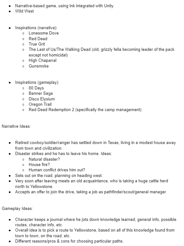
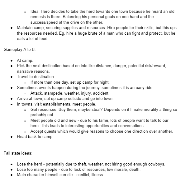
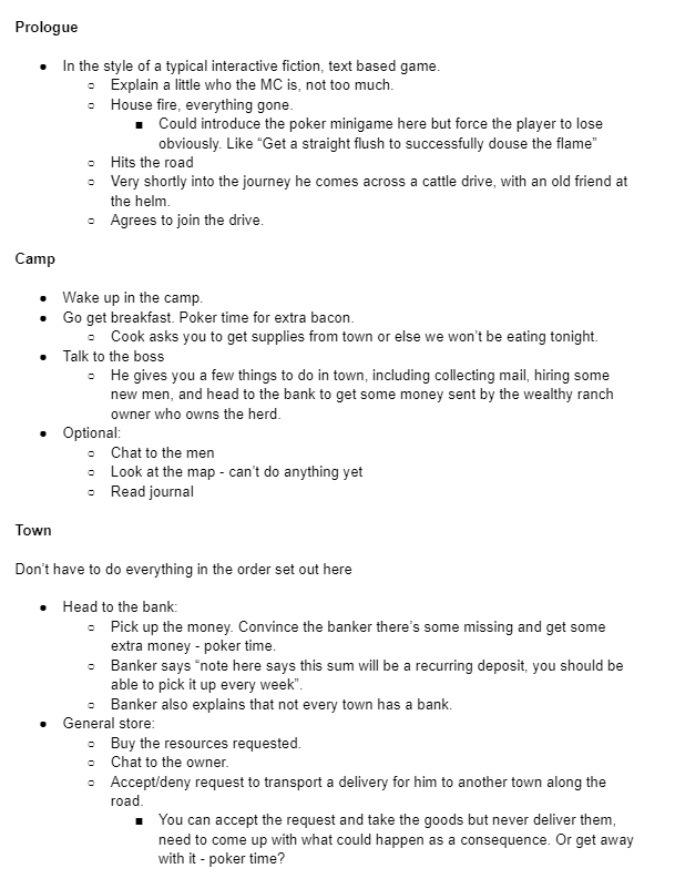
With all of these ideas floating around, it was about time I wrote some of it down. I made a mind-map of all sorts of random ideas, but really I’m a fan of a good bullet-point list, so I opened up a document and regurgitated my whole imagination into this sprawling list. I’ll include screenshots, but really it boiled down to:
- Game about cattle drive travelling across the west
- Protagonist - Old retired cowboy who is unwillingly and undeservedly famous due to a highly fictional, unauthorised bestselling biography about him.
- Player chooses a route, based on information picked up in conversations with NPCs.
- Replayability - one player could pick a completely different route than another (see Inkle’s “80 Days”)
- Camp hub - player is in charge of upkeep, resources, etc (see Red Dead Redemption 2’s camp)
- Hireable and fireable camp members
- Poker hands as dice rolls
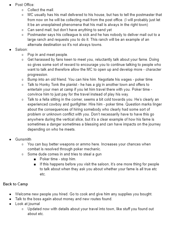
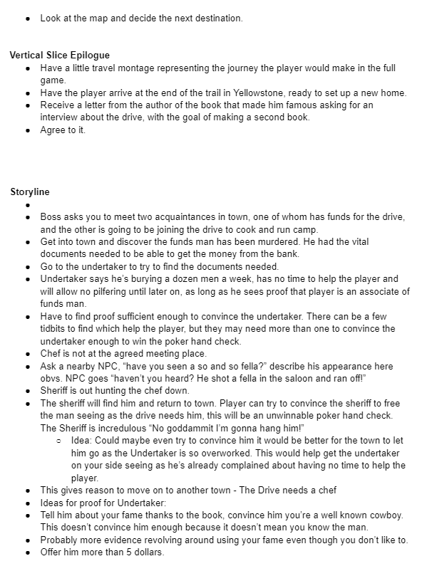
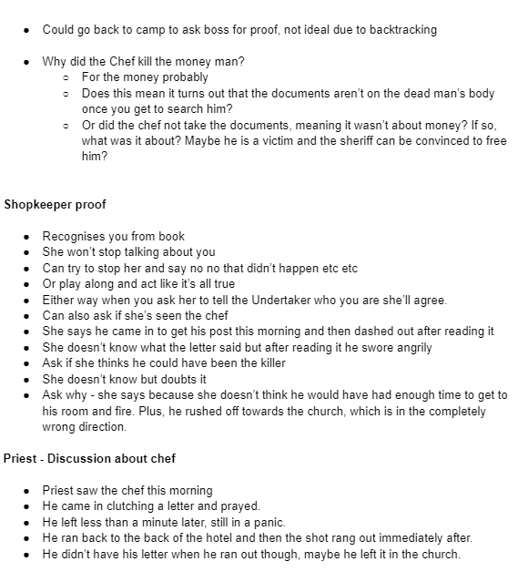
I was obviously aware that this was a lot of stuff to successfully implement into a 7 month long project at a good standard of quality. I internally justified it by telling myself “it’s just a vertical slice”, but realistically I had no choice but to do a scope breakdown. I took a look at all my ideas and made the decisions not necessarily based on what was most important to my narrative vision, but what I thought I would be able to successfully implement to the highest standard.
It would be no good having a journey across 3 towns if the towns were half-baked with nothing to do. I also decided to do away with the resource management mechanics, which was quite painful, but I felt that it would lead down a rabbit hole of trying to fine-tune an inventory system, a currency system, and balance it so it was fun but not tedious. This would potentially take away from the narrative side, and so it had to be cut.
I had no intention of cutting away the poker hand mechanic, whose conception had been possibly my greatest ever “Eureka!” moment. I felt that keeping it would be very beneficial to both the narrative and the gameplay, whilst serving as my unique selling point.
At this point I also had no intention of cutting out the camp/hub area, where the player would wake up, collect quests/requests from camp members, and choose where to travel to next. However, I did end up cutting it later down the line, when time began to run away from me.
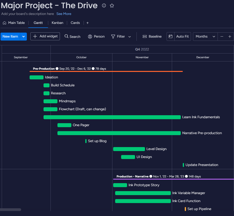
I created a schedule using monday.com, with the intention of it giving me a guide to use throughout the whole year. Naturally these schedules never go to plan, but if you at least try to stick to them then you’re giving yourself every fighting chance of success. Here’s a screenshot of my plan for the first semester:
The Magnificent Seven
Now there was no putting it off any further - I had no choice but to get stuck in. Thankfully, I had the greatest 7 (or 8-10 but that ruins the heading) week run of my game development life so far.
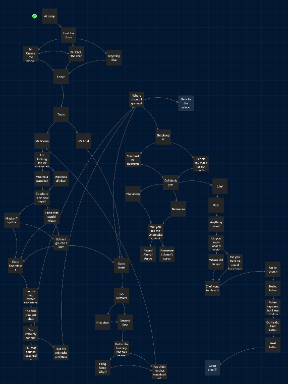
I came up with the storyline I wanted to create for the main town in this project, which would take up the bulk of the game. It revolves around an easy job gone wrong, where the player is sent to talk to two people to complete two simple tasks. It becomes a murder-mystery, when it is discovered that one is dead and the other is the prime suspect. I used Twine to plot it out in a more visual format than bullet points, enabling me to see how it all connected, although as the project continued I admittedly did stop using this method.
October rolled around and I had still never used Ink, and hadn’t used Unity in over a year. This obviously had the potential to be a pretty large hurdle, because the premise of my whole project revolved around it. I had to learn Ink, and figure out how to integrate it into Unity. I learned a lot from watching talks given by Jon Ingold, Inkle’s Narrative Director and one of the masterminds behind Ink. I learned not just about how Ink actually works, but lots of narrative design and writing theory in general. Some interesting tidbits included:
- Core Beats - Not every beat needs to be hit by every player, but beats should escalate
- Choice Pattern - 3 is best - neither binary nor overwhelming. Accept, reject, and deflect gives the player agency and variety, opening up new branches for each.
- Trapdoors and Loops - Use trapdoors to speed up progression and use loops to slow it down.
I think perhaps the most valuable takeaway for me here was the first bullet-point. It says to me that it’s ok for players to miss certain plot beats or to choose one over the other, but they should never be punished for making a choice. By this I mean that their choice should always progress the story in one way or another, and they shouldn’t have to go back and make the other choice or talk to the other NPC because the one they picked was a dud. One last thing Ingold said, which isn’t really something I learned but is something that I found comforting, is that Inkle makes games strongly focused on narrative, and tries to make as little game as possible. This is basically what I’ve done with this project, so it’s cool to see an award-winning studio admit it outright.
Other ways I learned Ink were through just general tutorials on YouTube, like those of Jason Weimann, and through the extensive Ink Documentation, which covers basically everything Ink can do. Ink also gives you an example story which shows how to make the most out of its structure and capabilities. Overall, it took no time at all to become confident in using Ink’s most basic functionality, like choices, knots, stitches, diverts, variables, and so on.
Next up I had to figure out how to use Ink in Unity. Downloading the official plug-in was easy of course, but from there on out it felt quite complicated. Thankfully I was once again rescued by YouTube tutorials. In particular, those of Trever Mock were extremely beneficial.
I was able to set up a dialogue system bespoke to my needs by following Trever’s tutorial and adapting it so it would better suit my game. Eventually I was able to approach an NPC in Unity, enter dialogue with them, make some form of choice, and exit dialogue. Once all the logic was set up, it became very easy to create an ink file, and a few clicks later play it in-game. I made a quick little video of an example of this working. This scene was just me experimenting with creating something a little bit more longform and is not in the final game.
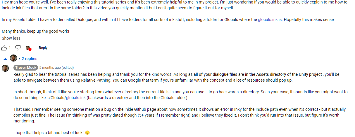
The next important step was getting it to work so that variables could persist across different ink files, which obviously is vital to create a game relying on the outcome of conversations with multiple NPCs. I struggled a little with this at first, so I decided to leave a comment on Trever’s channel and see what happens. Luckily enough, he replied and it turned out I just hadn’t a clue about a little something called relative pathing.
With that all sorted, I was finally able to remember variables between conversations. At that point I was 100% confident that this project was very doable. This spurred me on to finish what was essentially my core functionality, all before the Christmas break. The last piece of the puzzle was the card mechanic. I had already learned by now how to control UI elements based on Ink variables, so honestly the card mechanic - in its original core functionality - was easy. I decided to have 10 numbers, so 1-2 equaled a high card, 3-4 a pair, 5-6 a three of a kind, 7-8 a straight, and 9-10 a royal flush. I don’t know if I’m factually accurate here, but in my head this felt like it would increase the randomness of the draw.
I created a little demo, where an NPC would ask you to get a random number, and then a representation of cards would show on screen depending on the number and its correlation to a poker hand. It still looked ugly and very much like a prototype, but it shows that mechanically my game was almost complete.
Now the only thing left to do was the entirety of the writing, level design, and UI.
Christmas Break
Over Christmas, momentum began to falter. After the holiday was over, I managed to get stuck into writing dialogue, and I got a good few conversations put in. I wrote all the characters at once, so that the game was playable to a certain extent. It’s easier this way to get the choices bouncing off each other between conversations. It also meant that I didn’t finish any one character, and the game was still a far way from anything even resembling a finished playable build.
I got a level built out and a decent chunk of narrative implemented, but not as much as I’d hoped for. I sourced all assets used in the game from Synty Studios, using their Polygon Western and Polygon Western Frontier Packs. I already owned the Western pack, and managed to get the Frontier pack on sale. These packs go hand in hand and enabled me to have a great art style through sheer purchasing power alone.
Using these assets, I built a town level. When I think about western towns, I imagine long streets perfect for stand-offs and duels, and so that’s what I tried to recreate.
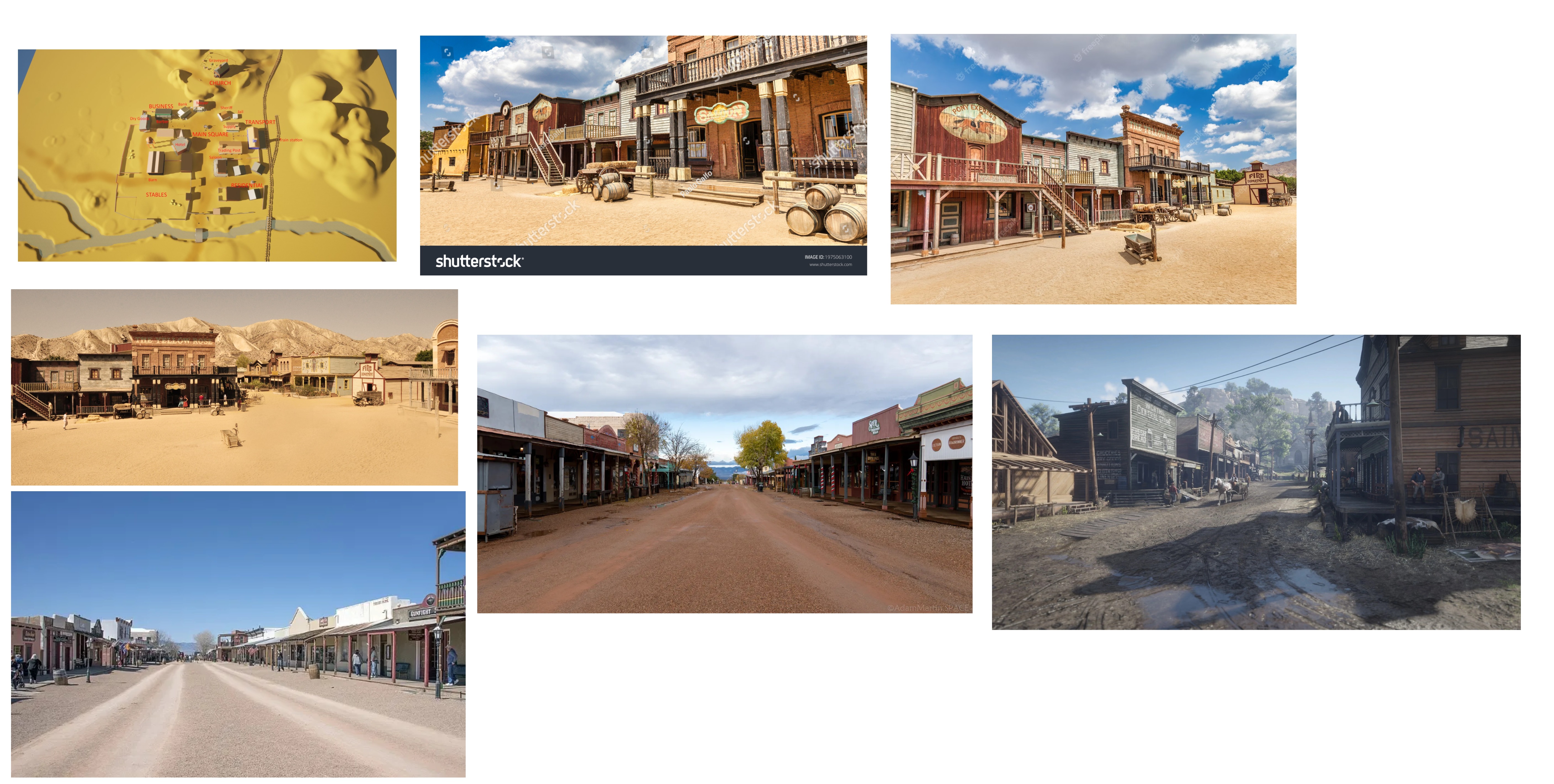
Some time close to Easter I had a technical issue and lost basically all of my project back ups, and was left with only the project in its most up to date format. This means I unfortunately can't go back to document how the town looked, and I can't seem to find much evidence in the way of screenshots. I made a short street, with only three buildings either side. At one end was a church, and the other end was a train station. At the time I was happy enough with it - I thought it fulfilled the image in my head of a narrow street, perfect for a duel. I admit at the time I also had the mentality of "I'm not focusing on level design so it's not too important" but of course, without a good level design the whole level will feel lifeless and it would be difficult to implement any sort of good narrative. I can say with hindsight that it was dreadful, too small, too narrow, and provided very little in the way of exploration or narrative opportunities. Plus, this game has no combat. So why was I so obsessed with building a street perfect for a gunfight? When I came back from the Christmas break, feedback from lecturers opened my eyes to these issues, and I resolved to rebuild the town. Unfortunately, it took me a very long time.
The Hateful Eight
In the eight weeks between coming back to Uni at the end of January and going off for Easter at the beginning of April, my progress was honestly much slower than I would have liked. I think I lost a bit of motivation, and just got really into my head about it all. I just began to really doubt my ability to write something semi-decent. I did of course work during these weeks, including more writing, but also some other important stuff like making a shader for entering buildings, and an actual dialogue panel UI rather than Unity’s default grey panel.
I’ll cover the writing first, because there was disappointingly little done. I created the shopkeeper, who is available to talk to after you’ve spoken to the Undertaker. She’s a big fan of the player, and you can use her to find out more information about the missing chef, as well as try to get her to help you prove to the Undertaker that you were acquainted with the deceased Mr Graves.
The shader was a necessity for narrative reasons, or else honestly I wouldn’t have done it. It’s not something I’ve any experience or real interest in learning, but for this case it was either make a shader or have a town where everybody stands outside. I think I could have gotten away with it for a good few of the buildings, but the narrative required the player to enter at least the saloon and the church. It also threw up the unexpected problem of having to change the Unity render pipeline my project was using, but thankfully this was actually painlessly easy.
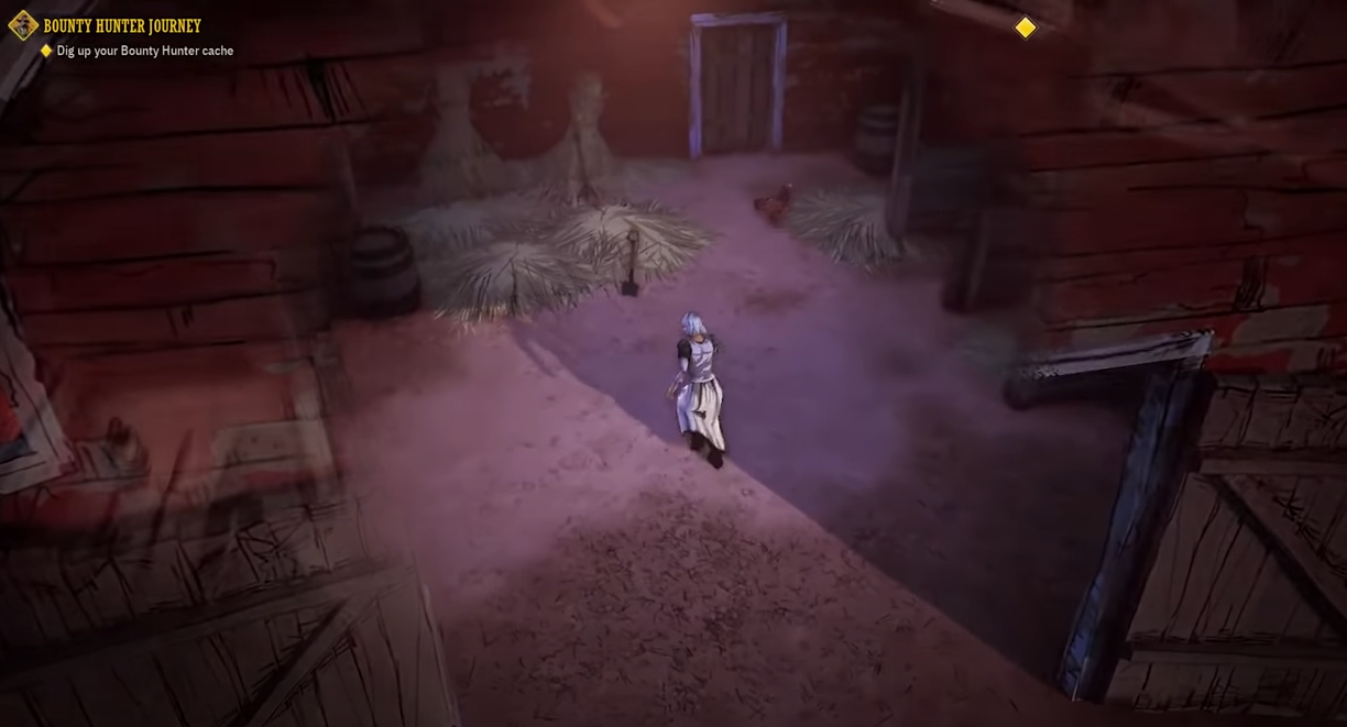
I wanted something similar to how it’s done in the game Weird West, where there’s a kind of sphere of translucency that appears and expands when you enter buildings. It’s a great effect, and just works perfectly. I used a tutorial by Daniel Ilett on YouTube to figure out how to actually create the effect, and then wrote the script for triggering it-in game myself, as I only wanted it to occur when you were actually inside the building. Once I had this all set up, I realised it cuts out the whole building, not just the walls between the camera and the player, so I took the models into Blender, edited them so I had a version that kept the walls I still needed and the floor, and then placed these models in the scene with the exact same transform as the original. It worked great, and you can see it below.
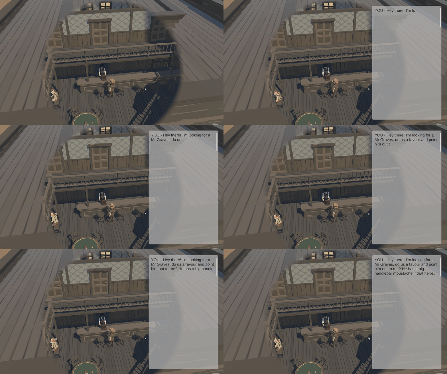
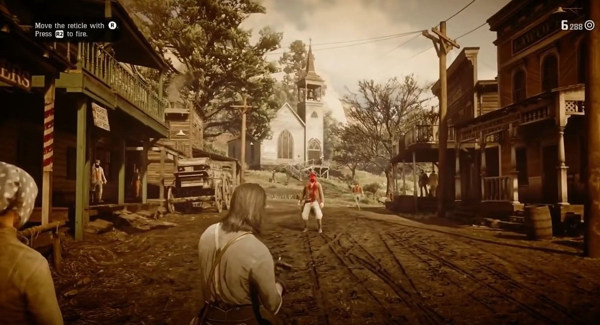
For the UI, I always knew I wanted it to be reminiscent of something akin to Disco Elysium. I just love how their system works, with the scrolling panel on one third of the page. Robert Kurvitz, the game’s creator, says this is done thanks to Twitter, which has basically conditioned people into preferring a constantly scrolling feed of information. In terms of its presentation, I had no idea. I got together a load of images and created a moodboard.
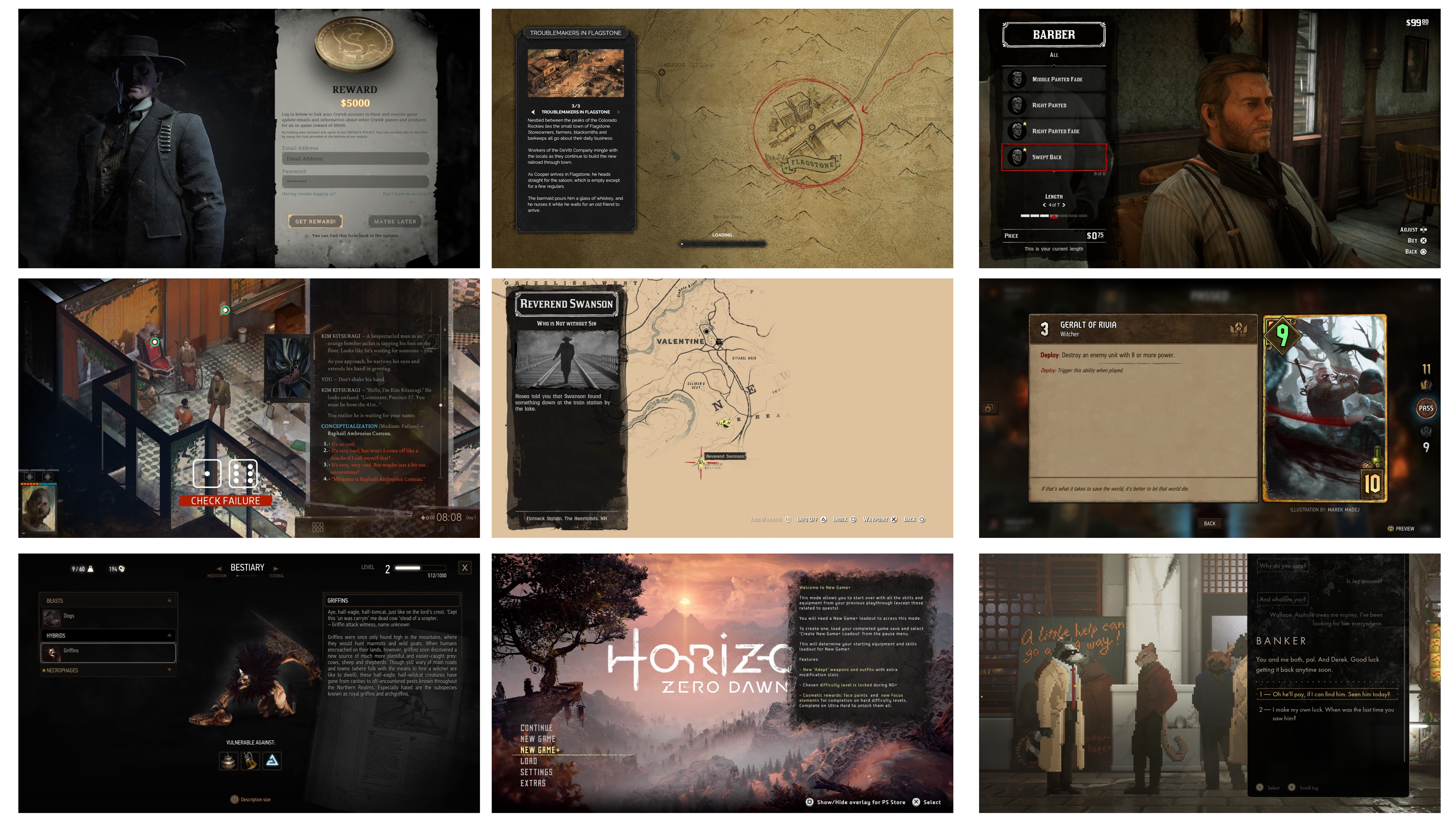
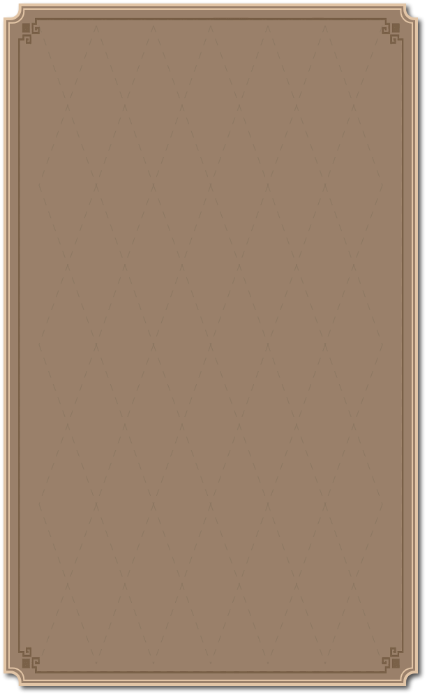
I cropped a lot of these panels down and then overlaid them over a screenshot of my game, trying to find one that I thought looked best. At first I preferred the style found in RDR2’s info panel on its map, but after about 30 minutes of flailing around in Photoshop I realised I didn’t have the artistic skill required to create something that looked so dynamic and inky. I went with my second favourite, a much easier to create panel that actually with hindsight fitted the overall style of the game better anyway.
Easter Break
With that half of the semester over, I went into Easter knowing I was going to have to really pick up the pace on development soon. I knew by now that the camp was not going to happen, and I would have to come up with a different way to onboard the player. I also knew that the town needed to change drastically, and that the story really needed to progress. But knowing all this, I still couldn’t get over the hurdle.
I came out of Easter having only achieved one thing - a new town build. Thankfully, this time it genuinely was good. The layout felt more natural, it had a focal point, it gave more space to explore, and therefore more space for narrative beats. I finished it just as Easter was coming to an end, and I had finally gotten over the hurdle.

Blazing Saddles
From here on out I was flying, full steam ahead. I don’t think the town was actually the issue holding me back, but I think improving it and feeling like I’d made something good whipped me into shape again. I did as much (or realistically, probably more) work in the next four weeks before submission than I had done in the whole semester so far. Here’s a list:
- Finished the main quest line - the game is fully playable now
- Added extra characters and quest ideas that I hadn’t yet imagined (Farmer, Barber)
- Created a little intro video
- Finally gave the card mechanic actual UI with animations
- Went back and integrated the card mechanic more - up until now I’d neglected it
- Added in some sounds and VFX
- Made the dialogue auto-scroll so the player could keep up easier
- Learned to use Ink’s external functions, allowing me to control non-Dialogue aspects of the gameplay through Ink.
- Made a quest log
- Made a main menu
- Made a good tutorial
- Gave player the choice to choose their name and outfit
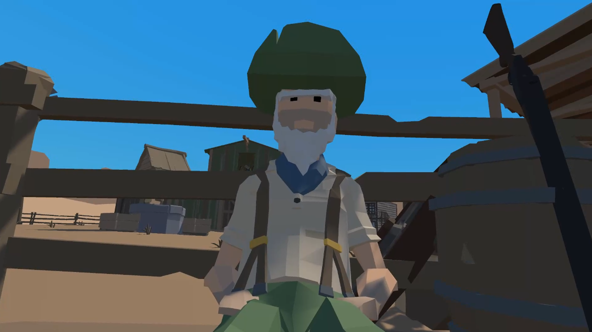
I was at this point really pleased to have finally gotten into the swing of things. The game had come along leaps and bounds. I found my favourite character in Farmer Green, who I hadn’t even envisaged until this point. He’s a weird guy who seems to be a big fan of Aristotle, a shout-out to my dissertation, who asks the player a riddle.
I always struggled to give my cowboy a name. I came up with a few during pre-production, but I felt unsure about it, so I never ended up naming him. I realised that it would be extremely easy to let the player pick one. It would have been nice if I could let the player actually type it, but I didn’t know if that was possible, so I gave them a choice. This choice was TITUS, OTIS, or GUS. I’m sure there’s other good cowboy names, but these felt particularly yeehaw to me. It meant I had to go through all my Ink files and do a find and replace for every time I’d written “YOU” and replace it with the Ink variable {yourName} but this was just tedious rather than difficult.
Learning how external functions work in Ink was super handy, as it extended what I could do from within Ink. I could now add and remove objects from the scene, which allowed me to let the player pick up items, as well as other things like remove obstacles like a closed door so I could make a new narrative section available in a new building (The Bank) when I needed to. It allowed me to make a quest log, as I could create a function which takes a string and adds it to the text panel in the log. For example, I could write something like ~updateQuestLog(“Find Mr Graves in the saloon”) and that string would appear. This was a vital addition, as it meant the player shouldn’t get lost or forget what they’re doing, which was something I felt was a real possibility.
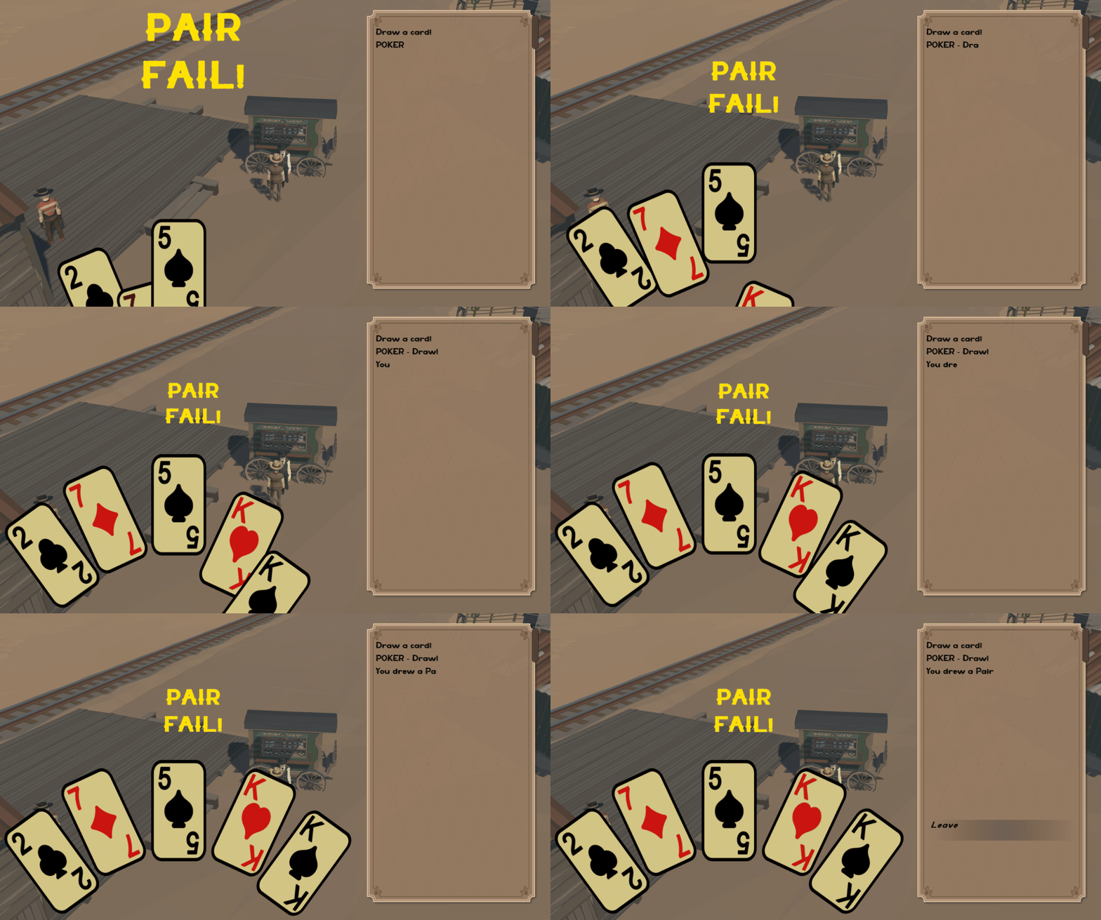
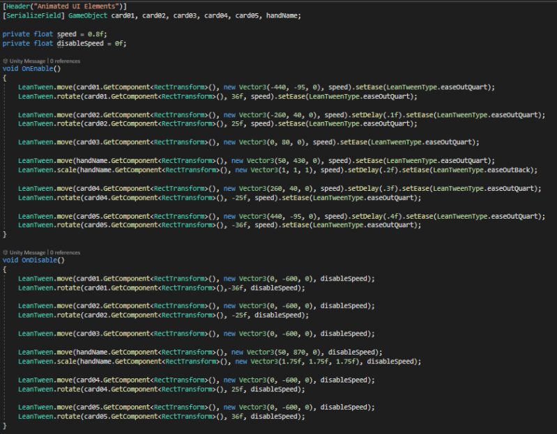
The creation of a proper UI design and animations for the poker mechanic only took a couple of hours one afternoon and the game massively benefits from it. I had read online that keyframing UI animations is considered a bad practice now, and that it’s supposedly better to do it through code. I therefore installed the Unity plug-in LeanTween, and learned how to animate through it. It was a pretty simple thing to learn, and even though code is never pretty unless you’re a real nerd, it’s at least very readable.
The Good, The Bad, and The Ugly
Overall, I’m very pleased with this project. I think if I were able to show it to my old September 2022 self he would be a very happy student. Of course there’s clearly a lot of ideas that were thrown away that he might miss, like the camp, resource management, and any sort of representation of travel. I’m not sure I’d say the current project suffers for it, but I’d still prefer to have been able to do it. And that’s why the time I wasted during the first half of second semester is most frustrating. The project could have been in its current state by the end of January, and I would have had all of this time to do loads more. I could have had the camp, I could have experimented with introducing the hire/fire crew mechanic, I could have introduced a little bit of resource management. The list goes on.
Regardless of these issues, I 100% achieved every goal I set for myself, and personally feel like I’m a highly competent Ink user now. The whole dialogue system in general is easily reusable, so I’ve managed to create something I could use again and again in as many projects as I want, with only a little work required to adapt it to each project’s needs. I believe the project represents me as a narrative designer starting out with strong potential, and I hope somebody sees that in me when they play this game. If you look at itch.io for other games made using Ink, of course there are lots of really great games, but I don’t think I would be embarrassed to have mine alongside them.
And so, if I’m happy enough to say “yeah, this project is good enough”, then that’s good enough for me.
Get The Drive
The Drive
Ulster University Final Year Major Project - A Narrative Cowboy Western
| Status | Prototype |
| Author | owenhmarshall |
| Genre | Adventure |
| Tags | cowboy, ink, Narrative, Singleplayer, student, Western |
Leave a comment
Log in with itch.io to leave a comment.